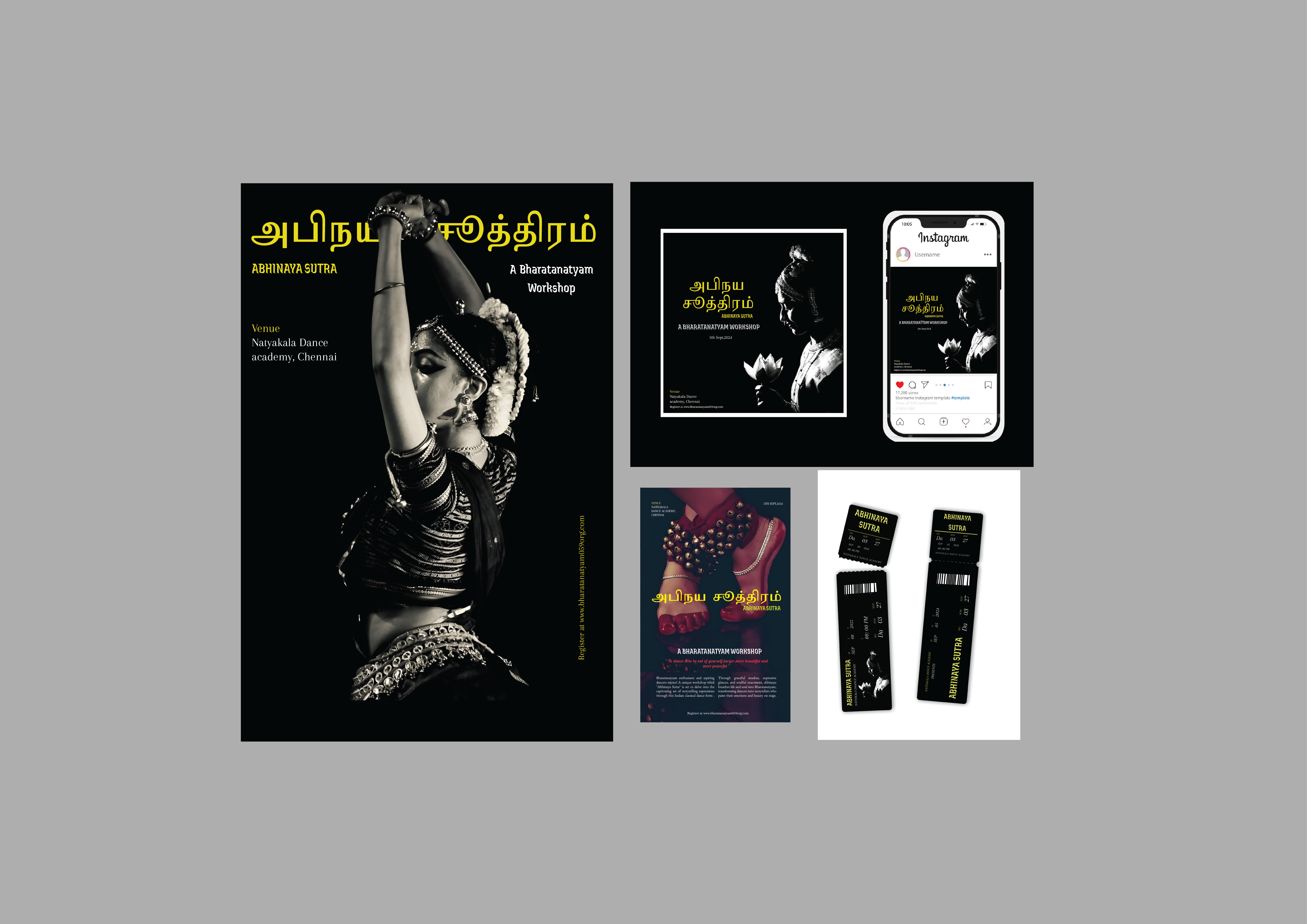
Abhinaya Sutra – A Bharatanatyam Workshop
For this typography assignment, I chose to build a visual identity around a fictional Bharatanatyam workshop titled Abhinaya Sutra. Bharatanatyam, with its structured body language and emotive storytelling, offered a perfect blend of geometry and grace — ideal for typographic exploration.
This project includes four deliverables: a poster, a social media post, a newspaper ad, and event tickets. Here’s how I approached each element:
1. Poster
The poster is the hero asset. I used a powerful monochrome image of a dancer to create a striking visual foundation. Typography was layered to reflect both clarity and culture — Tamil for authenticity, English for accessibility. The bright yellow accent color adds energy and draws focus to the event title and venue details. The overall composition aims to mirror the poised yet dynamic nature of the dance itself.
2. Social Media Post
The social media version adapts the core design into a more responsive, scroll-friendly layout. The type remains legible and impactful, even on smaller screens. Key information like event name, location, and date is emphasized using size and spacing. The color palette and fonts are consistent with the poster, ensuring brand continuity across platforms.
3. Newspaper Ad
This version leans into a more formal tone, suitable for traditional media. The layout follows a tighter grid, with the type hierarchy guiding the reader’s eye smoothly from headline to call-to-action. I maintained the use of Tamil alongside English to preserve the event’s cultural identity, while streamlining the composition for readability in print.
4. Event Tickets
The tickets serve as a small but important brand touchpoint. Designed in a sleek black format, the type is minimal yet intentional — easy to read at a glance, but still consistent with the visual system. Elements like bilingual labeling, admission type (e.g. General/VIP), and clean line breaks keep it functional and stylish.
Design Reflection
This project was an exercise in balancing cultural nuance with modern typographic clarity. Bharatanatyam provided rich visual and conceptual material to work with — from symmetry and rhythm to emotion and storytelling. I aimed to reflect that spirit in the design language, allowing type and layout to dance with the same grace as the art form itself.